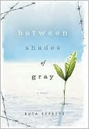
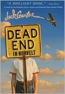
Ooh, don't you love a quiz? In no particular order, here are some winners and notables. And, in the immortal phraseology of Sesame Street, WHAT ABOUT THESE IS KIND OF THE SAME?
I'm no expert in book design but something in my gut tells me that if you want your novel to be taken as "award-consideration worth" or "of serious literary merit," steering away from photos-of-girls covers may be a very good idea.
IF you want to test my theory a bit further (I will add a caveat that there is the occasional photo image but the person is generally SMALL and contextualized in a LANDSCAPE, not mooning out at you while wearing a pretty red dress), take a virtual wander through this year's ALA winners or ALA Medals books from years past (hints: WHEN YOU REACH ME, THE GRAVEYARD BOOK, THE TALE OF DESPEREAUX). Or consider some other titles recently on the hype radar (hint: THE FAULT IN OUR STARS and, er, THE HUNGER GAMES).
ANYBODY WANT TO WEIGH IN ON THIS?


16 comments:
Damn! I never even noticed but... you're totally right!
Hey there! Wow, interesting observation.
What I was thinking while reading this was, it all comes down to the WRITING! :D
Thanks for stopping by, Gretchen.
Totally agree with you, Christina, about the WRITING in the end but I do have to say that, when I see some poor girl in an ultra-mini at a dinner party, I sometimes don't take the time to ask her if she's a real rocket scientist. I might even avoid her--and she might be a Nobel Laureate, right?
Ditto Gretchen! Though I do covet the occasional pretty red dress for myself...
Oh, sigh, I so, so, so much wanted an illustrated cover!
An interesting observation but I think it may be a spurious correlation. For one thing, you have to remember that books are given girlface covers for sales reasons. Pure and simple. I know we're all sick to death of it but it's clear that girlface covers sell books.
Yes, books that skew literary rarely have girlface covers. They tend to be a bit more artistic. I'm not sure this is anything new. Girlface covers go for a certain demographic (more commercial/high concept). Books that require a little more thought eschew girlface for something that evokes the emotional core of the book.
Plus, covers really are about tastes. WHERE THINGS COME BACK is an amazing book but I hate, hate, hate the cover. Nothing about it says "pick me up." Absolutely nothing. Every time I see it, I think it's some self-published book where the author did their own cover. (And I'm hating the paperback cover for the book too. I'm glad it won so many awards and will get noticed because the covers are really turn-offs.)
Also, NOT a fan of the Gantos cover. At all. That may be the most un-Newbery like cover in the history of the award. That's not a knock on the book but compare that with other Newbery covers and it might as well be a girlface.
I have ALWAYS thought this :) But didn't notice. Great eye!
Please also note that Barnes and Noble has a HUGE amount of influence on covers. When Borders was still around, it was OK if B&N skipped a title. Nowadays, that's not true. Smaller publishers pretty much have to cowtow to what they want and their preference is for the Big Girl Face covers. They'll buy non-Big Girl Face if it's a big house willing to invest in the promotion of the book.
You make FABULOUS points, Andy. Agreed, I have no way to prove causality here. That said, I'd like to posit that girlface covers sell SOME books. There is an argument to be made that the abundance and similaritu between these covers dilute sales for some authors. And now I'm wondering, given that a huge percentage of books barely (or don't) make back their advances per se, how the girlface cover is holding up stats-wise. You've inspired me to do more research. Another post t.k.!
That's an interesting observation! I don't pay much attention to covers (titles are what grab my interest) so I hadn't really thought much about it. But these cover differences are because of the audience. The Newbery Awards are for middle-grade novels and an illustrated cover is probably going to be more compelling to a kid. Photo covers are usually YA novels and teenagers are more drawn to those real-life looking covers.
Thanks for stopping by Katherine & Katy.
Per your comment, Laura, I must tell you that I think my thesis pretty much holds up for the Printz awards, too, which are specifically YA!
You make a very interesting point, and I love illustrated covers. But I think you're wrong in saying the covers for The Returning and Between Shades of Gray aren't photo-illustrated. I googled and found the larges version of each cover, and unless I'm mistaken both are very much photographs. Specifically on Between Shades of Gray, the barbed-wire seems to be photographed, thus the combination of it with the background image creates a photo-illustration. I'm not trying to be nit-picky, and I think you make a good point about these covers not being the typical girl face covers. But I don't think you're right about them not being photo-illustrated.
I agree that literary books are more likely to be illustrated, especially the hard back version. Sometimes, the cover changes to a photo for the paperback. I just went through my bookcase. Here is a list of a few winners with photo covers and photo illustratrated blends:
Story of a Girl
A Northern Light
Out of the Dust
Pictures of Hollis Woods
The Disreputable History of Frankie Landau-Banks
Ha - I thought the thing in common was going to be related to the fact that every cover has either a plant, a bird/flying image, or both. There's probably a symbolism discussion there. ;) On the photos, I agree with Andy and Dan. Also, as Laura notes, I don't think it'd be reasonable to lump MG and YA together to make the point anyway -- since it's pretty conventional wisdom that MG titles are WAY more likely to be illustration covers while YA titles are rather more likely to be photo covers. (I can barely think of a MG book, award-winner or not, that has a photo cover. A few, but not many.) So you'd have to look only at Printz winners to make a valid comparison, I think. That said, I looked back at some Printz books and you probably have a point. Wonder how much of it is related to the fact that Printz books are statistically rather more likely to be written by men and/or about male characters, etc than we'd expect based on the gender ratios of YA authors generally. (And therefore the covers are less likely to be those girly face photos. Now THERE's another interesting argument we could have! :))
I'm with Joni - I thought what they had in common was plants and birds - at least until I got to Why We Broke Up. I really hate how much influence B&N has on covers, and I'm sure all the girl-photo ones are a result of that influence.
Wow. Thanks for the thoughtful comments, Dan, Megan, Joni & Helen. You make great points. I'm also wondering about the one-word-title trend and seeing a lot of longer titles amongst winners, too. I dunno, maybe I should be revising my ms instead of thinking so much about these weird commonalities that are most likely just coincidences. Anyhow, a fun chat!
Post a Comment